 Voxilin← Back to the siteBook a Call

Brilvate · Manchester, United Kingdom
Wear Your Mood A Bold, Mood-Led Store for Brilvate
Website and App — Website and Branding
We redesigned Brilvate’s online store around how its young customers really shop: by mood. Four edits, playful scrapbook-style design and practical filters, built with developers and strategists, make it a store that’s as bright and fun as the clothes
A bold brand with a familiar-looking store
Brilvate sells bright, expressive clothing: satin varsity jackets, faux fur, cow-print fleece, graphic tees and wide-leg denim. The clothes had real personality, but online the brand risked looking like any other store, with the usual grid of products sorted into men, women and tops. The client came to us wanting a website that felt as loud and joyful as the clothes, and that turned browsing into something people actually enjoyed.
Finding the customer behind the clothes
Working with the client’s business strategists, we started by defining who Brilvate was really for. The answer was young, style-driven shoppers who use clothing to express how they feel. They discover fashion through social media, shop mostly on their phones, and are more likely to look for a vibe than a category. They don’t think “I need a jacket.” They think “I want to feel loud today.”
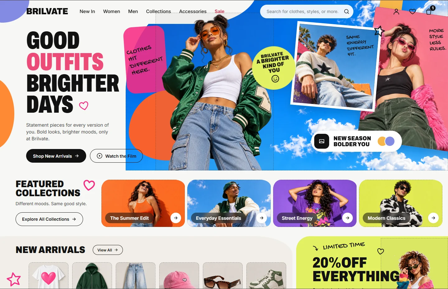
That insight became the strategy for the whole site. Instead of asking shoppers to start with a product type, Brilvate would let them start with a mood. Together with the strategists, we grouped the range into four edits, each with its own energy: The Summer Edit for sunny days, Everyday Essentials for chill ones, Street Energy for loud ones, and Modern Classics for timeless style. The brand line followed naturally: different moods, same good style.
Designing it with the people who would build it
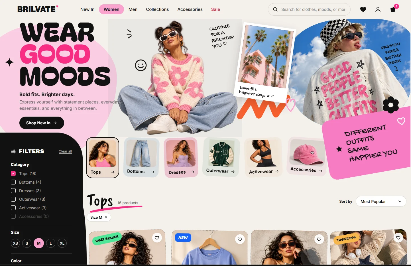
The visual language came straight from the audience. Bold condensed headlines like “Good Outfits, Brighter Days” and “Wear Good Moods” sit alongside handwritten notes, polaroid-style photos and playful stickers, in a palette of hot pink, orange, lime, purple and sky blue. It feels like a scrapbook more than a catalogue, which is exactly how this audience shares fashion online.
Mood runs through every part of the experience. The Collections page invites visitors to “Pick Your Mood” with simple filters for Sunny, Chill, Loud and Classic, and even the search bar asks people to search for clothes or moods. For shoppers who know exactly what they want, the category pages stay practical. There are clear tiles for tops, bottoms, dresses, outerwear, activewear and accessories, a filter panel showing how many items are in each category, quick size selection, sorting, and badges that flag best sellers, new arrivals and trending pieces.
We worked closely with the developers from the first sketches. The stickers, polaroid cards, mood filters and product tiles were designed as a reusable set of building blocks, so new collections and campaigns could be launched without redesigning pages. We also made sure the image-heavy layouts stayed fast and worked well on phones, where most of Brilvate’s shoppers would arrive. Meanwhile, the strategists shaped the homepage around the business goals, putting new arrivals, featured collections and limited-time offers like 20% off everything exactly where shoppers would see them.
The results
The new Brilvate website feels like the brand it represents: bright, confident and fun to explore. Shoppers can start with how they feel and land on outfits that match, or go straight to the product and size they need in a few taps. The reusable design system gives the client’s team a fast way to launch new edits and campaigns, while the homepage gives promotions and new collections a clear stage. Most importantly, the store finally speaks the same language as its customers: different outfits, same happier you.